Visual Texture: Dimensional Tactility in Graphic Design
Visual Texture Dimensional Tactility in Graphic Design
Pattern
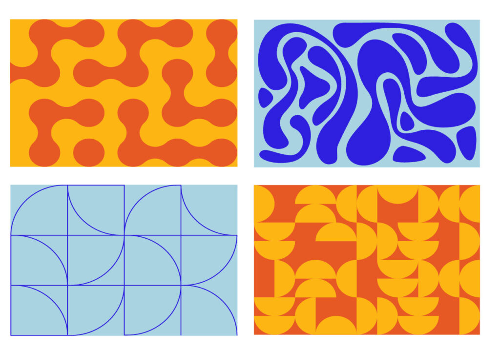
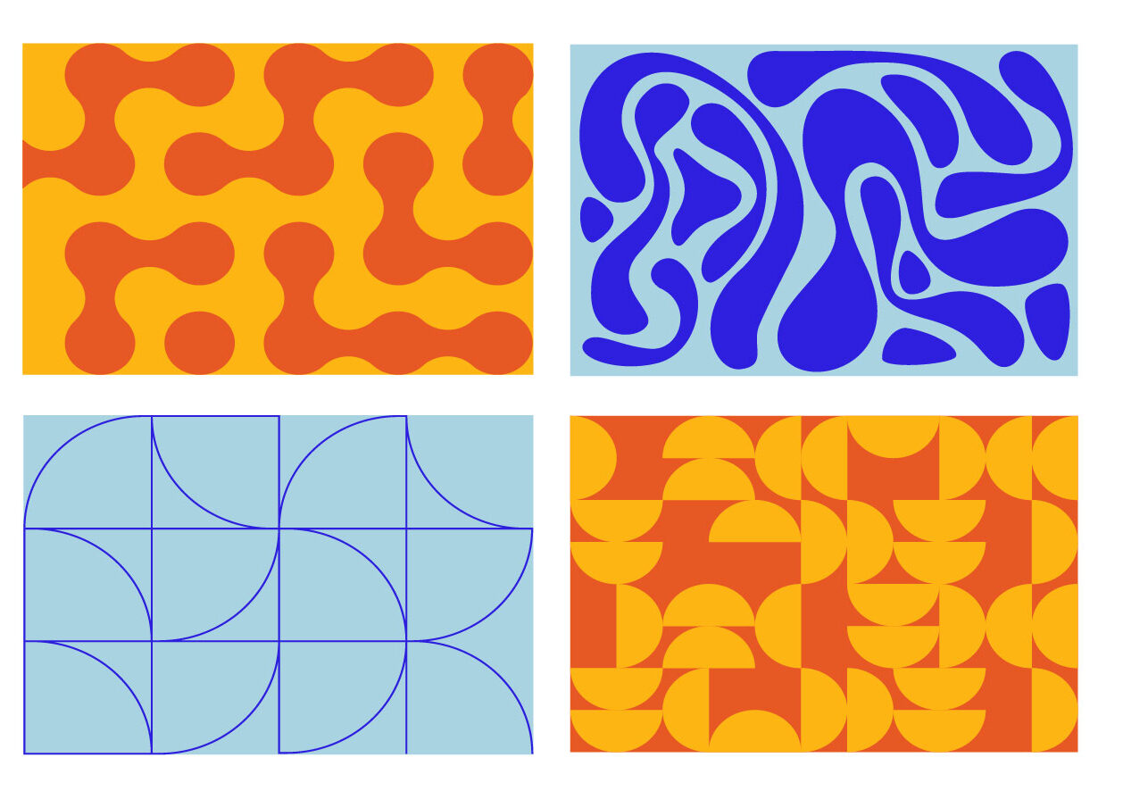
Patterns are generated using a regular series of shapes and colors in a structured formation, usually by computer. Patterns may be sharp and strict or organic and smooth, but they are always repeatable. Overlaid atop a flat color or gradient background, patterns communicate a sense of neatness, stability, and modernity.
Environmental & Biological
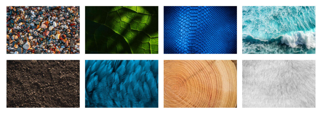
Natural elements such as feathers, fur, clouds, dirt, tree bark, water, and scales can introduce a sense of rugged individuality and wholesomeness. Echoing our organic surroundings in a piece can ground it in reality and associate it with the calm and/or wildness of nature.
Man-Made
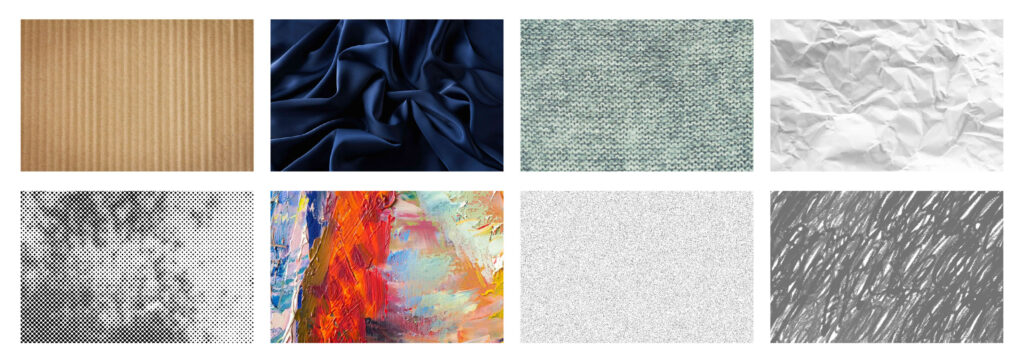
Paint, pencil, cloth, paper, grain, halftone, prints, and fabric bring a sense of humanity to a designed piece. Mimicking the imperfect glide of a paintbrush or pencil in typography and illustration makes a design feel more approachable and “real”. Grain overlays echo the nostalgia associated with physical media and make artwork pop out from the page.
While it may be tempting to incorporate as much texture as possible in a branded piece, it’s easy to go overboard. Too many textural elements may clog a design and distract from important information. Additionally, not all brands benefit from its usage. A clean, minimalistic tech company may want to keep its branding plastic-smooth and to-the-point. Such brands often rely on other ways to generate visual interest, such as depth through drop shadows and layering.
Whether used as a subtle background element or as the backbone of a piece, texture uses the audience’s lived experience as a conduit through which to convey information. Feeding the viewer’s mind with pleasant imagery promotes familiarity, emotion, and, finally, connection.